🌍 Proudly serving clients worldwideBook a Free Strategy Call →
+91 700 226 6993 Schedule a Call
Shopify Store Transformation Case Study

Ayros

BoroTech Solution redesigned the Ayros Shopify storefront around a premium, minimalistic, conversion-focused shopping experience — repositioning a functional store into a brand-led fragrance destination.

IndustryFragrance & Personal Care
ServiceShopify Redesign & UX Strategy
AgencyBoroTech Solution
Visit Live Website
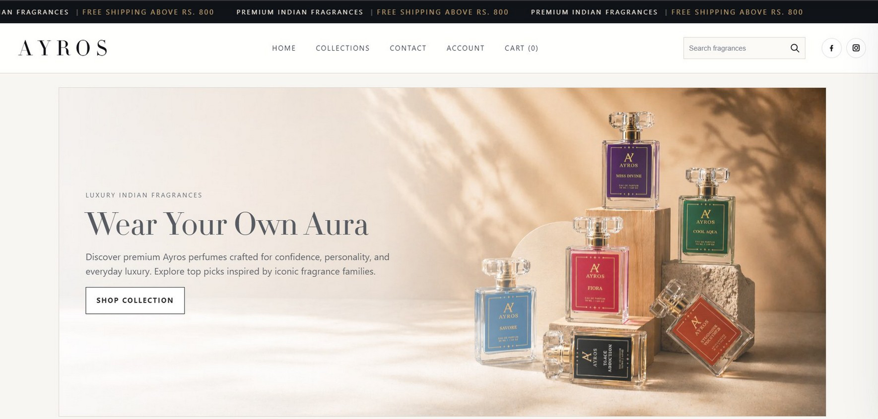
Ayros homepage after redesign — Wear Your Own Aura hero section
Executive Summary

A functional store, repositioned around premium value

Ayros had a functional Shopify store, but the earlier experience did not fully express the premium value of the fragrance brand. BoroTech Solution redesigned the storefront around a premium, minimalistic, conversion-focused shopping experience.

The Situation

  • Hero presentation was more product-banner led than brand-led
  • Product listing experience needed stronger hierarchy and clearer CTAs
  • Product pages needed better fragrance storytelling, trust cues, and purchase confidence
  • The store needed a premium, minimalistic interface aligned with higher-intent customers

The Transformation

  • Repositioned the visual language for premium customers
  • Rebuilt homepage, collection sections, product listings, and product detail pages
  • Applied product page best-practice patterns from market-leading e-commerce experiences
  • Improved discovery with Best Sellers, Women's, Men's, and Duo Combos collections
  • Built a more campaign-ready storefront for ads, social traffic, and seasonal launches
Client Background

A luxury Indian fragrance brand

Ayros is positioned as a luxury Indian fragrance brand for customers who expect elegance, clarity, and confidence before buying fragrance online. The redesign shifted the storefront from catalogue-like to editorial and premium.

The Business Challenge

Three areas holding the storefront back

01

Hero Section

Large visual banner with limited brand story, no direct CTA or structured value proposition. Premium positioning did not feel deliberate enough.

02

Product Listing

Product cards were large but not conversion-led. Visual tags were present, but actions and hierarchy needed refinement.

03

Product Page

Functional, but with limited fragrance storytelling. Needed stronger notes, trust cues, pack logic, and CTA hierarchy.

Solution Strategy

Five moves that shaped the redesign

01

Reposition the store visually

Editorial fragrance imagery, minimalistic premium styling, whitespace, premium borders, and a refined visual palette so the store feels brand-led.

02

Make discovery easier

Clear collection entry points: Best Sellers, Women's Collection, Men's Collection, Duo Combos, and Explore by Mood.

03

Make every product card actionable

Ratings, price, availability, and Add to Cart buttons brought directly into the product listing experience.

04

Strengthen product decision-making

Fragrance notes, scent profile tags, stock cues, pack selectors, and purchase buttons added directly on product pages.

05

Improve mobile-first browsing

A cleaner mobile header and larger lifestyle-led product/collection presentation for social traffic and quick browsing.

Product Page Research

Benchmarked against market-leading fragrance competitors

We studied product page structures used by Bella Vita and Hira, then adapted those patterns for Ayros instead of copying them visually — reducing doubt above the fold before asking the customer to buy.

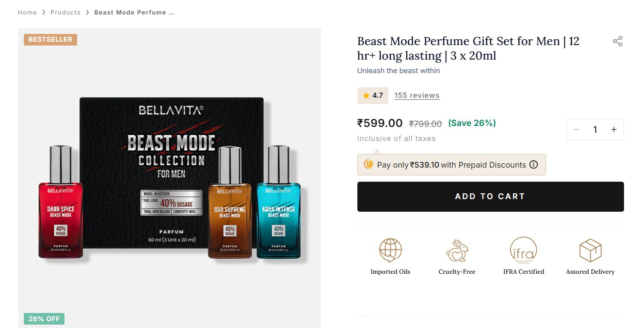
Bella Vita product page reference — competitor benchmark studied during research

What Bella Vita Does Well

  • Visible bestseller and discount badges create urgency and social proof
  • Rating and review count sit close to the title to reduce first-time buyer doubt
  • Price, compare-at price, and savings are immediately visible
  • Prepaid-discount messaging appears before the CTA
  • One dominant Add to Cart button with quantity control nearby
  • Trust icons — imported oils, cruelty-free, certification, delivery — sit below the CTA
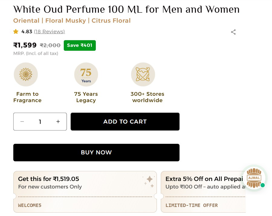
Hira / Ajmal product page reference — competitor benchmark studied during research

What Hira Does Well

  • Strong product title supported by scent-family descriptors
  • Rating and reviews near the top validate the product
  • MRP, discount/savings, and tax inclusion shown clearly before purchase actions
  • Brand credibility icons such as legacy, stores, and sourcing cues
  • Add to Cart and Buy Now separated to support browsing and direct checkout
  • Offer/coupon cards motivate customers who are still comparing prices
Product Page Strategy Map

From competitor best practice to Ayros implementation

Best-Practice AreaWhat Market Leaders DoImplemented for Ayros
Premium imageryHigh-quality product/lifestyle visuals to create desire.Editorial hero visuals, packaging shots, and product-led collection imagery.
Scent clarityExplain notes, mood, season, and use-case clearly.Fragrance notes, scent tags, weather/gender cues, and profile lines.
Social proofRatings, review count, and customer-favorite cues.Rating stars and customer-favorite messaging on product pages.
Purchase hierarchyMake the primary action visible and easy to choose.Buy It Now and Add to Cart structured with clearer priority.
Variants and packsLet shoppers select size, pack, combo, or variant quickly.Pack/variant controls and Duo Combo product pages.
Value cuesPrice, savings, stock status, tax/shipping clarity.Price comparison, stock-ready-to-ship cues, promotional shipping message.
Product educationBelow-fold details to support informed decisions.Fragrance notes and product explanation sections on PDPs.
Mobile readinessKeep image and CTA experience clean on small screens.Improved mobile header, collection browsing, image-led layout.
The Transformation

Four screens, rebuilt around trust and discovery

01

Homepage Hero

Before
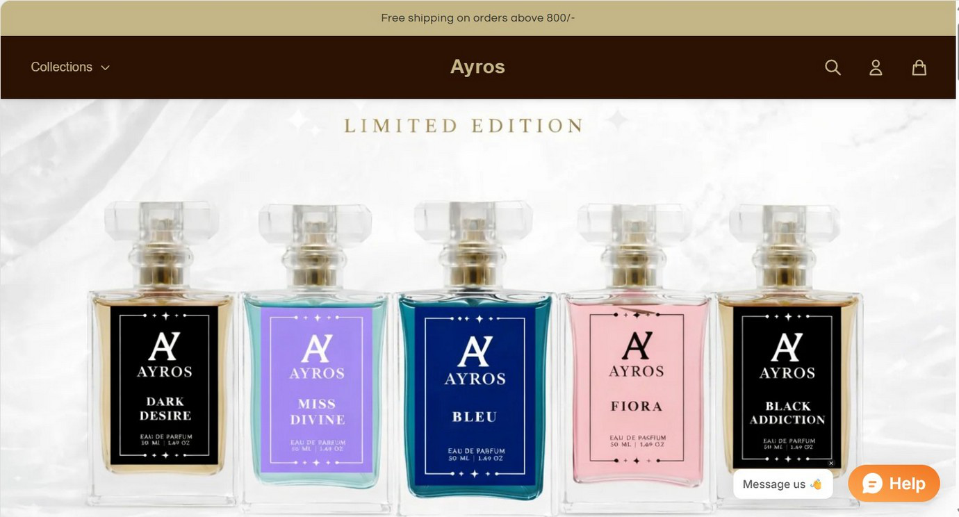
Ayros homepage before redesign — product banner hero
After
Ayros homepage after redesign — editorial brand-first hero

Why this mattered: the hero section is the first sales pitch. The redesign makes the brand easier to understand within seconds and gives shoppers a clear next step — refined typography, warm editorial lighting, and a clear Shop Collection CTA.

02

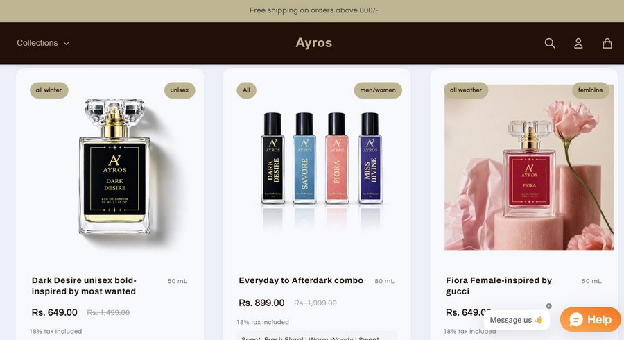
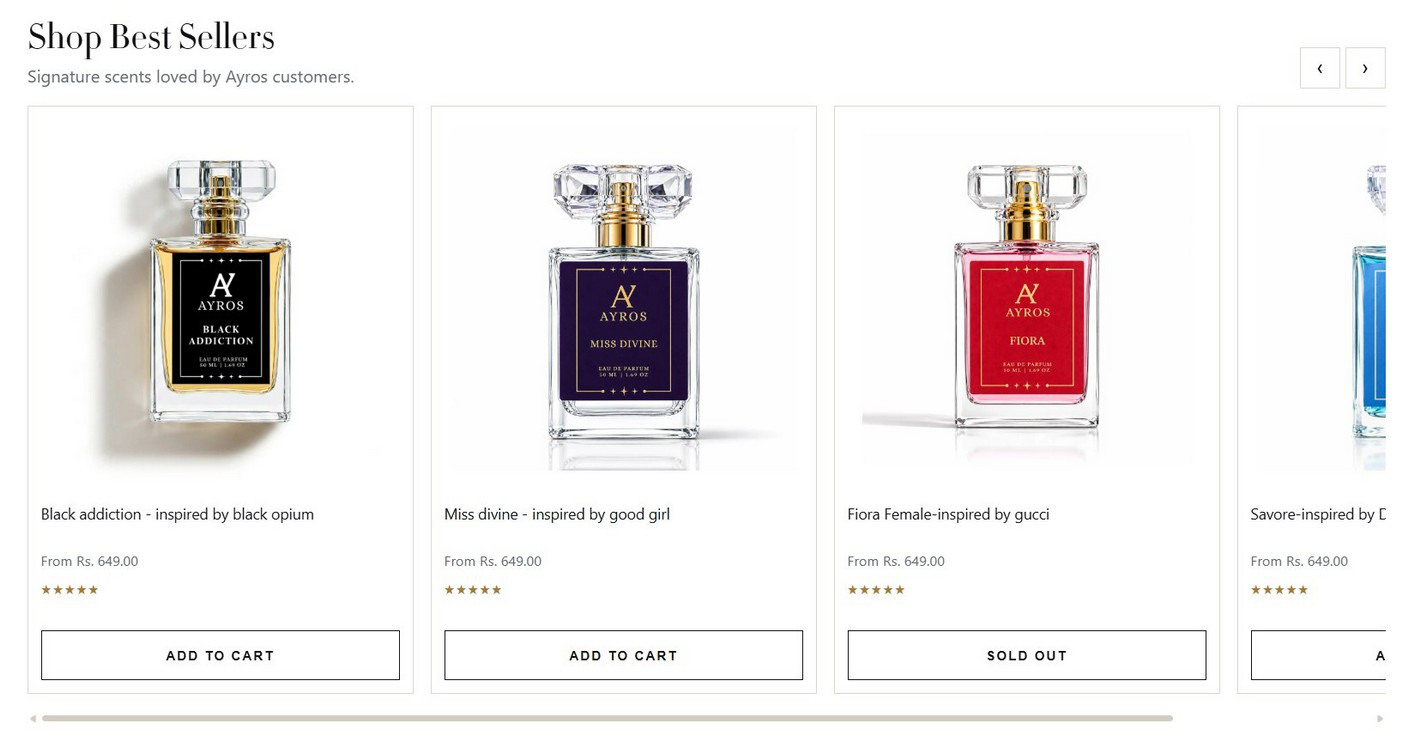
Product Listing Experience

Before
Ayros product listing before redesign
After
Ayros Shop Best Sellers listing after redesign — cards with rating, price and CTA

Why this mattered: better cards reduce decision friction. The new listing uses consistent cards, ratings, price, and availability states so shoppers can scan and act without entering every product page.

03

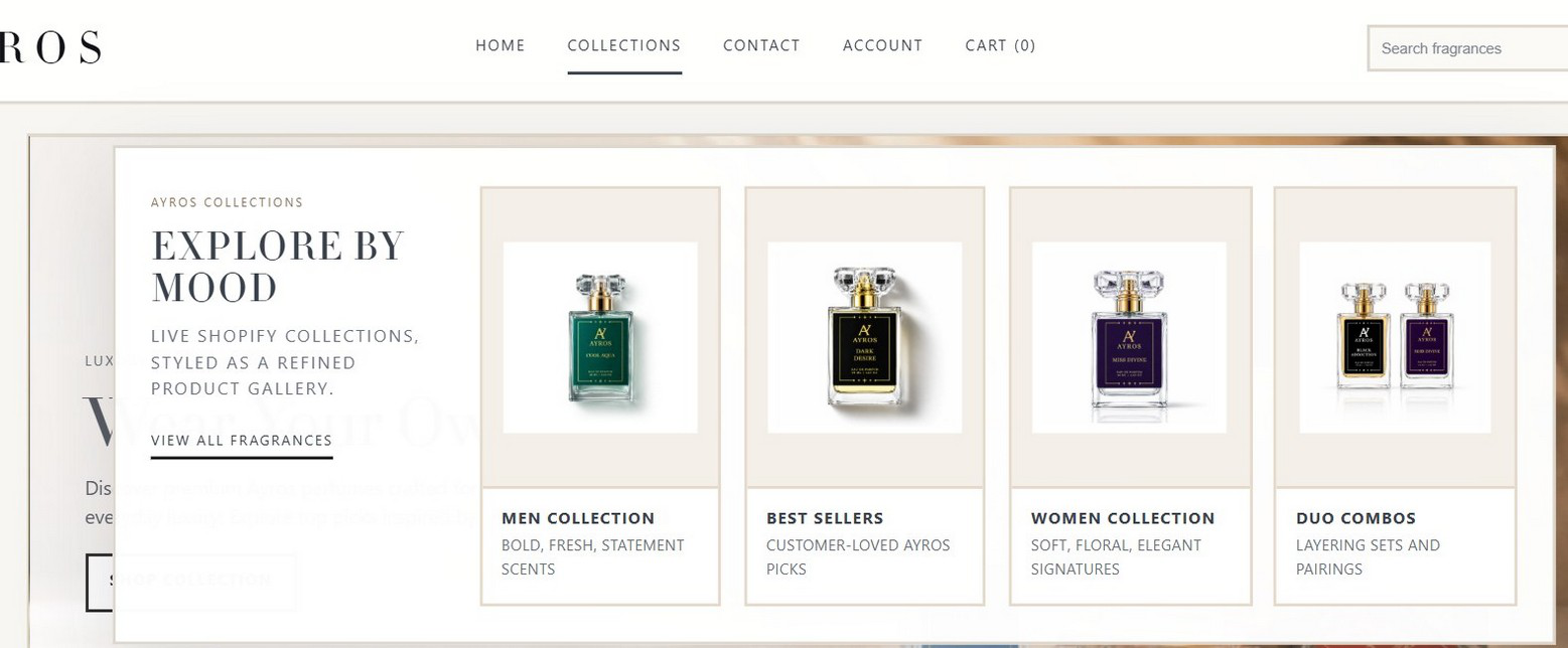
Collection Architecture

New Addition — Result
Ayros Explore by Mood collection gateway

Why this mattered: customers do not only browse fragrances by name — they browse by mood, identity, gifting intent, gender, occasion, and popularity. The store was reorganized into Best Sellers, Women's, Men's, Duo Combos, and Explore by Mood.

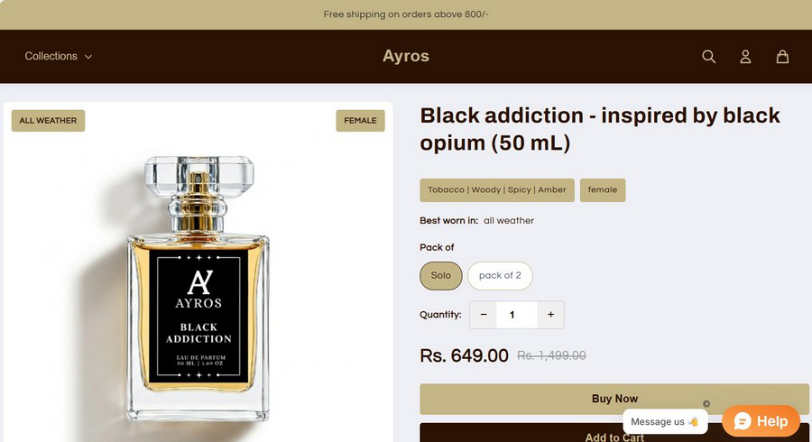
04

Product Detail Page

Before
Ayros product detail page before redesign
After
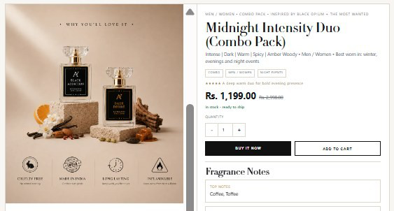
Ayros Midnight Intensity Duo combo product page after redesign — scent notes, price, stock and dual CTA

Why this mattered: perfume is an emotional purchase. Product pages had to translate scent into words, mood, and trust before the customer buys — the new PDP adds fragrance category, scent profile, price/saving logic, stock status, and clear Buy It Now / Add to Cart actions.

Social Proof & Creator Content

UGC testimonial videos, built into the storefront

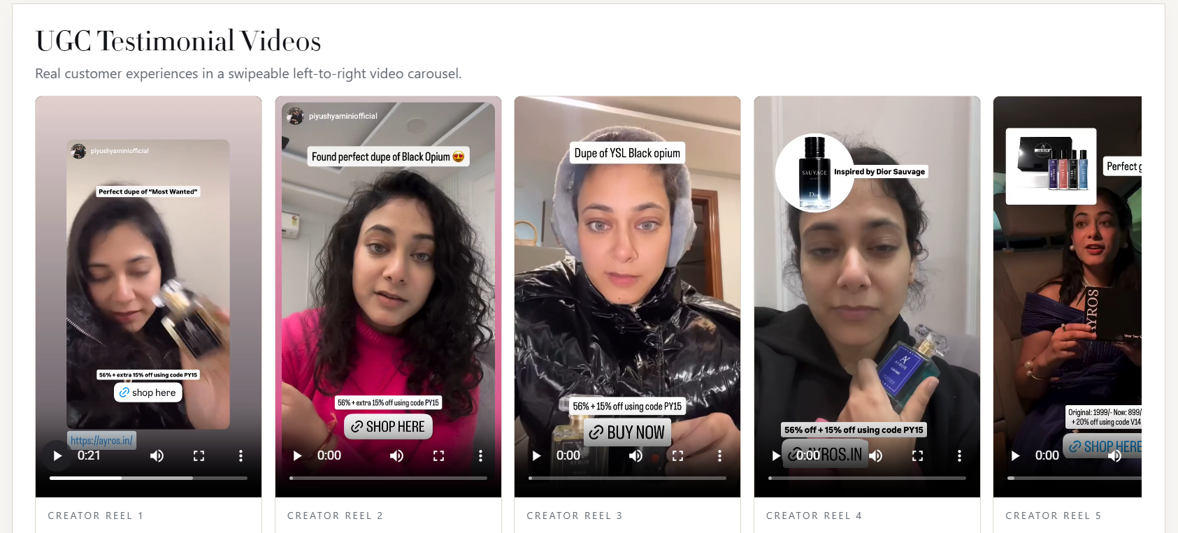
Alongside the storefront redesign, BoroTech Solution also implemented a UGC testimonial video section for Ayros — a swipeable, left-to-right carousel of real creator reels with shoppable captions, discount codes, and direct "Shop Here" / "Buy Now" actions, adding social proof directly into the shopping journey.

Ayros UGC testimonial video carousel — swipeable creator reels with shoppable captions and discount codes
UGC Testimonial Videos — Swipeable Creator Reel Carousel

Why this mattered: fragrance is a trust-led, sensory purchase. Real customer reels — reviewing scent, longevity, and value — sit directly in the shopping journey to reduce doubt at the exact moment a shopper is deciding whether to buy.

Website Showcase

A closer look across the redesigned store

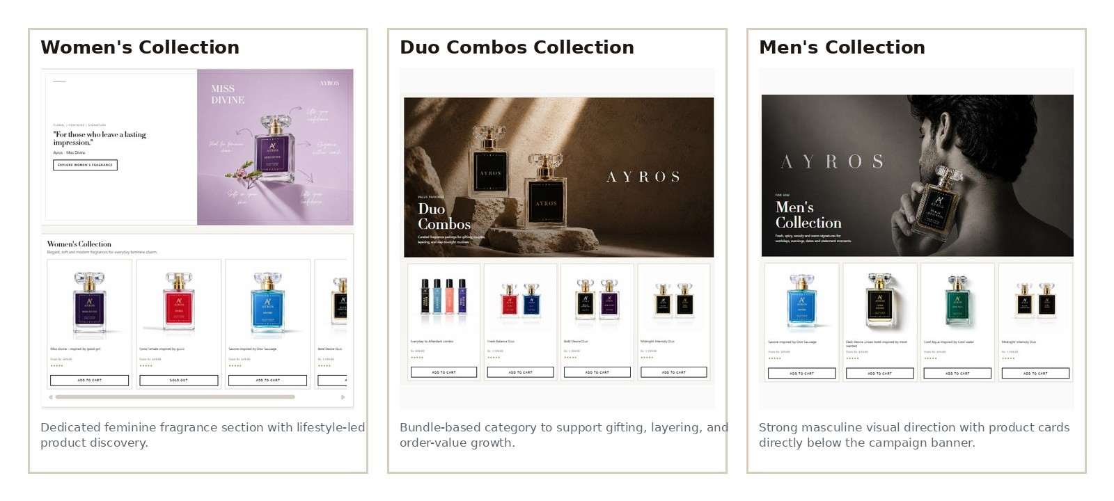
Ayros Women's Collection, Duo Combos Collection, and Men's Collection screenshots
Women's · Duo Combos · Men's Collection
Ayros mobile Men's Collection, Duo Combo product page, and packaging-led product page
Mobile Men's Collection · Duo Combo PDP · Product Page with Packaging
Change Matrix

What changed, and why it mattered

Change ImplementedWhat Was DoneWhy It Was Important
Premium minimalistic positioningAnalysed Ayros as a premium fragrance brand and created a cleaner, minimal, high-value storefront direction.Attracts higher-intent customers and improves perceived brand value.
Premium hero with CTACreated a clear first impression with headline, copy, and Shop Collection action.Improves clarity, brand perception, and homepage conversion path.
Refined navigation and searchAdded clearer menu items, account/cart access, search field, and social icons.Helps customers find products faster and trust the storefront more.
Collection-based shoppingAdded Best Sellers, Women's, Men's, Duo Combos, and Explore by Mood.Matches how fragrance customers actually browse: mood, identity, gender, gifting, popularity.
Improved product cardsStandardized image layout, names, price, ratings, CTA, and stock states.Makes products easier to compare and encourages action directly from listings.
PDP best-practice implementationApplied imagery, scent notes, social proof, variants, price, stock, and dual CTA.Reduces uncertainty and improves product page decision confidence.
Fragrance notes and scent tagsAdded notes, profiles, and fragrance language on product pages.Helps customers imagine the scent and buy with more confidence.
Bundle/duo sectionsCreated Duo Combos Collection and combo product pages.Encourages higher order value, gifting, and discovery of multiple scents.
Technology Used

Confirmed platform, with placeholders where verification is needed

E-Commerce Platform
Shopify
Theme / Frontend
[Insert confirmed theme/technologies]
Payment Gateway
[Insert confirmed payment provider]
Apps / Integrations
[Insert confirmed apps]
Hosting
[Insert confirmed hosting provider]
CMS
Shopify
Product catalogue management Customer authentication Shopping cart Checkout Variant / pack selection Responsive frontend
Expected Business Impact

What the redesign is built to influence

The improvements are designed to influence perception, discovery, and conversion readiness.

Stronger Brand Trust

A premium fragrance environment makes the brand feel more established and credible.

Better First Impression

The new hero communicates what Ayros sells, why it matters, and where to go next.

Higher Product Discovery

Collection sections make it easier to browse by mood, gender, best sellers, and combo packs.

Clearer Buying Decisions

Fragrance notes, profile tags, ratings, stock status, and pack options make PDPs more informative.

Improved Campaign Readiness

The storefront is better prepared for ad traffic, influencer campaigns, and seasonal launches.

Potential AOV Improvement

Duo Combos and pack options create natural opportunities for higher average order value.

Recommended KPIs to Track Next

Conversion rate Add-to-cart rate Product page view-to-cart rate Average order value Mobile bounce rate Collection click-through rate Search usage Revenue by collection

Note: no actual analytics were provided for this project. The impact above is presented as expected/strategic impact based on the implemented UX and design changes, not as measured results.

Have a Brand Worth a Premium Experience? Let's Build the Storefront It Deserves.

BoroTech Solution designs and develops conversion-focused e-commerce experiences that make products easier to discover, trust, and purchase.

Chat on WhatsApp