Repositioning a product-led storefront around relevance, proof, trust and decisive action — turning a basic product catalogue into a proof-led, conversion-ready skincare storefront.
The redesign brief. Aurelin already had a recognizable purple visual identity and a functioning e-commerce foundation. However, the existing experience presented products more like catalogue entries than persuasive sales pages. The redesign restructured the website around clear benefits, Indian relevance, visible proof, stronger product discovery and deliberate calls to action.
Primary objective. Help shoppers quickly understand what each product does, why it is relevant to their skin and climate, what evidence supports the promise, and exactly what action to take next.
The previous product page had functional purchase buttons, but it lacked the layered persuasion needed to trigger action: no visible result timeline, limited review prominence, minimal proof, weak urgency, and no strong articulation of why the brand is specifically relevant for Indian conditions.
A memorable market story centred on Indian skin and weather.
Offers, benefits, proof and CTAs arranged in the order shoppers need.
Reviews, consumer-perception content, UGC and product education.
Shopping by activity, concern and product need instead of category alone.
The original page worked as a product listing, but did not fully function as a guided conversion experience.

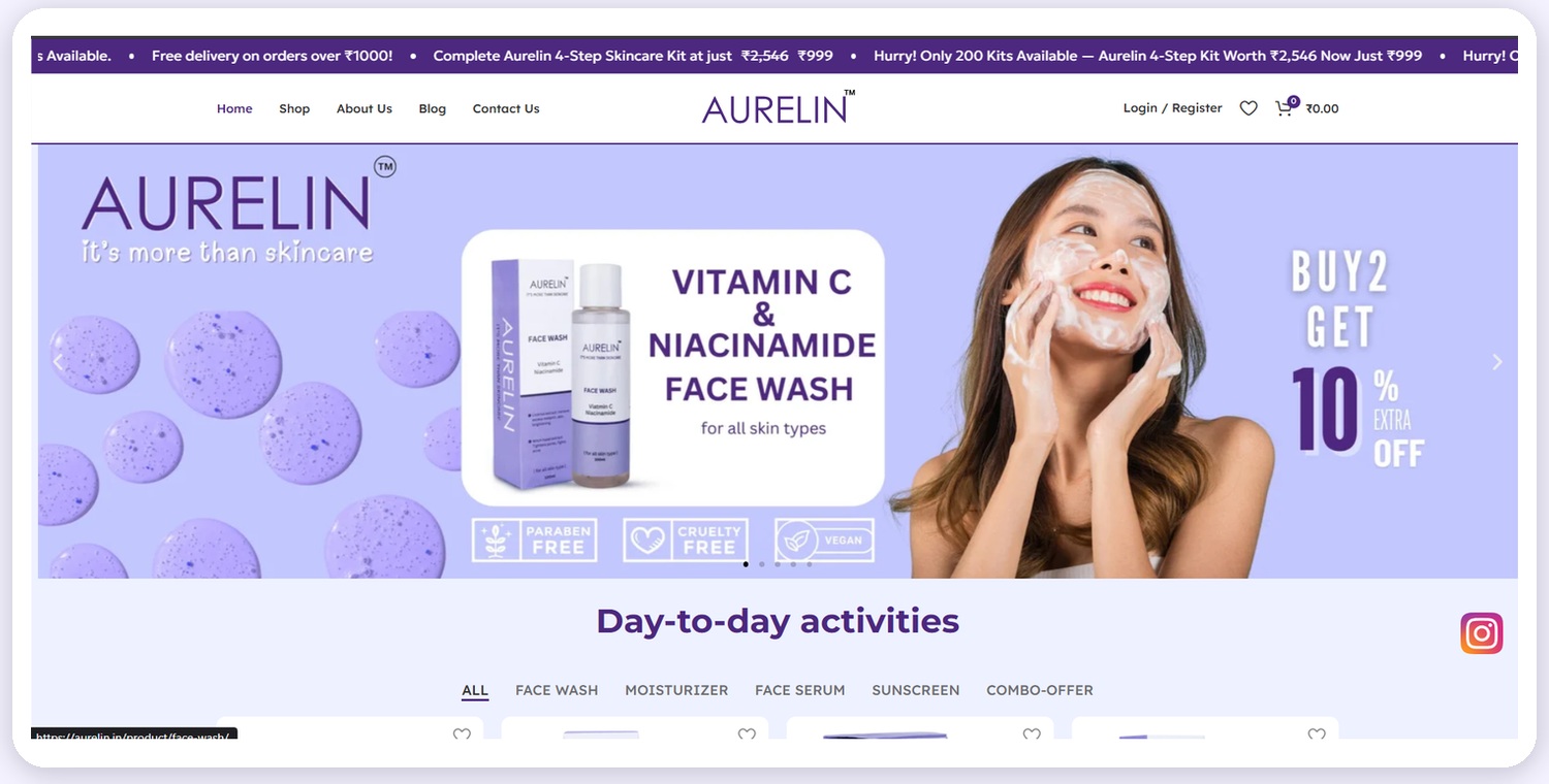
Before — the original homepage and product listing

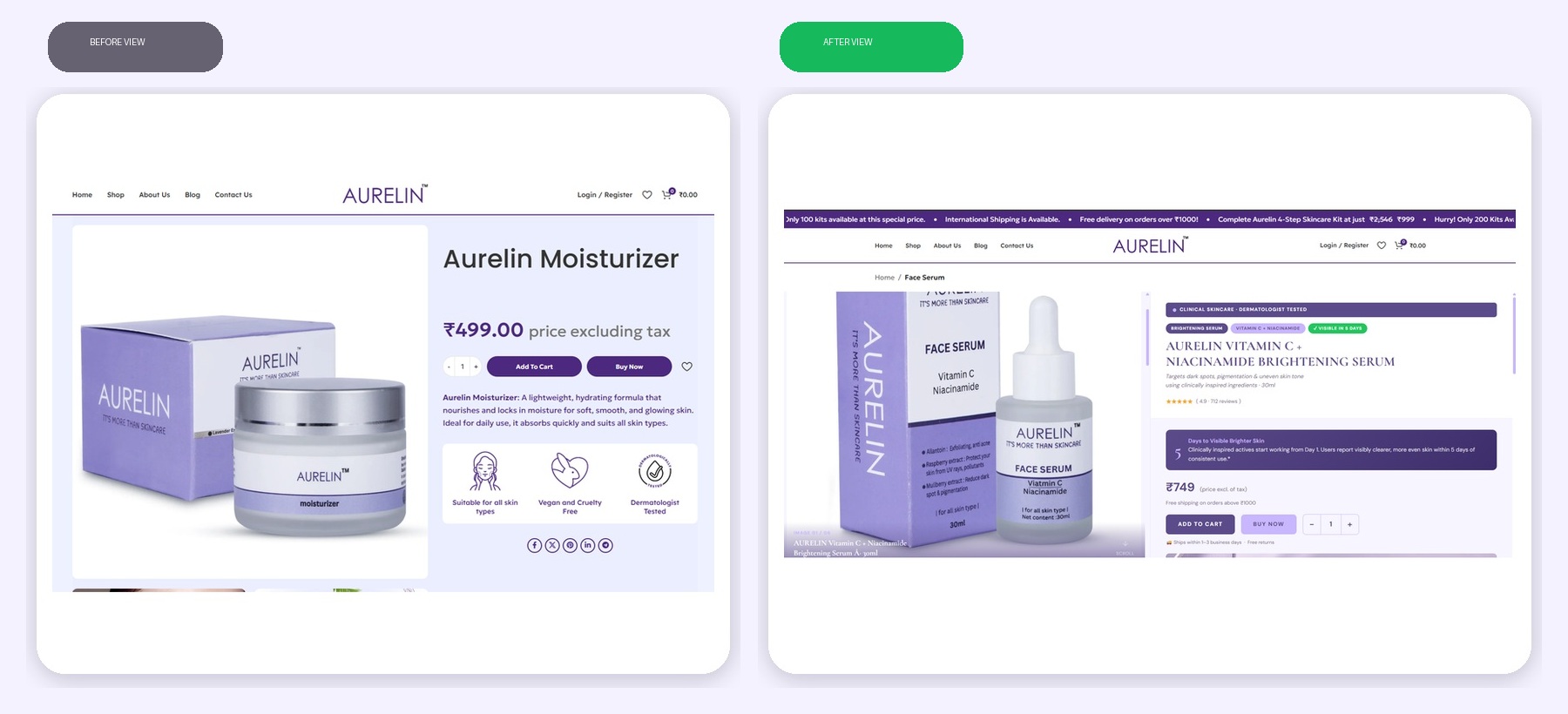
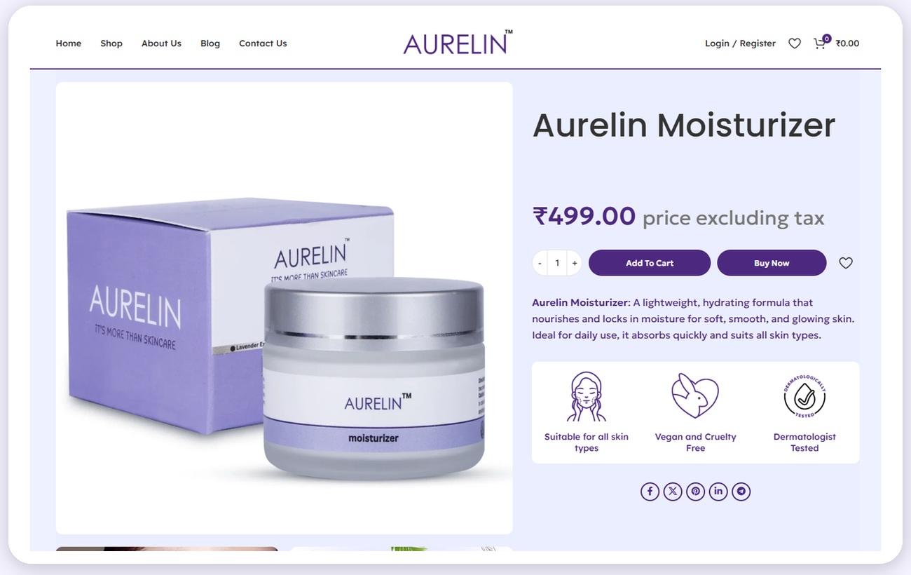
Before — the original product page
The title, price and a short description were visible, but the key transformation was not immediately clear.
Add to Cart and Buy Now existed, yet there were few nearby triggers that made the action feel urgent, safe or compelling.
The page relied mainly on product imagery and three benefit icons, without visible results, studies, or detailed outcome proof.
Customer experiences and rating distribution were not brought into the primary decision journey.
The interface did not strongly explain why the formulas are designed for Indian skin and Indian weather.
There was little structured explanation of who the product helps, how it works and why the formula is suitable.
The page answered "What is this?" but did not strongly answer "Why should I trust it, why is it right for me, and why should I buy now?"
Core DiagnosisA distinct brand message designed to feel locally relevant, credible and memorable.
"Made for Indian Skin. Made for Indian Weather. The only skincare made for us."
Core Brand MottoSpeak directly to concerns frequently experienced by Indian consumers: pigmentation, tanning, oiliness, humidity and uneven tone.
Connect product texture and daily usability to heat, humidity, pollution, sun exposure and changing seasonal conditions.
Move beyond generic clean-beauty language and build a stronger sense of belonging, specificity and cultural relevance.
Use benefit-led product names, concern language and visible result timelines.
Support the claim with consumer-perception figures, before/after presentation and reviews.
Make "Made for Indian Weather" a visible product advantage, not an afterthought.
Keep price, shipping, returns, quantity and purchase CTAs within one decision zone.
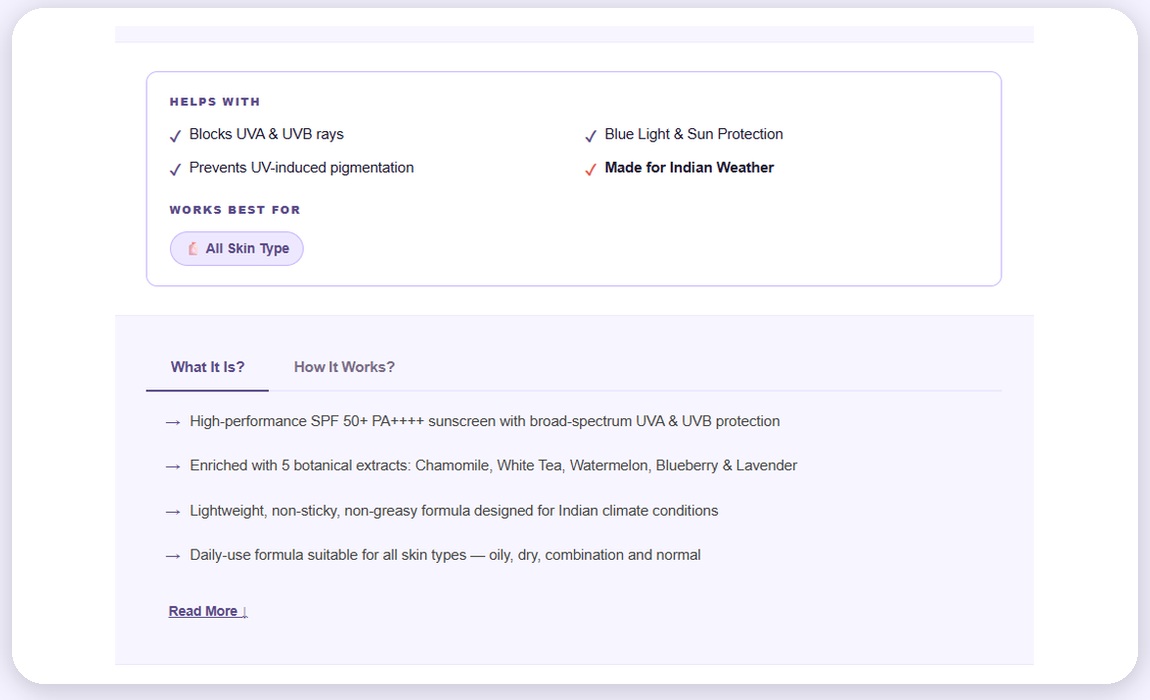
The redesign turns local suitability into a scannable decision module: protection benefits, Indian-weather relevance, skin-type fit, formula explanation and ingredient story.
A clearer entry point that combines promotion, lifestyle context, product discovery and immediate reasons to explore.

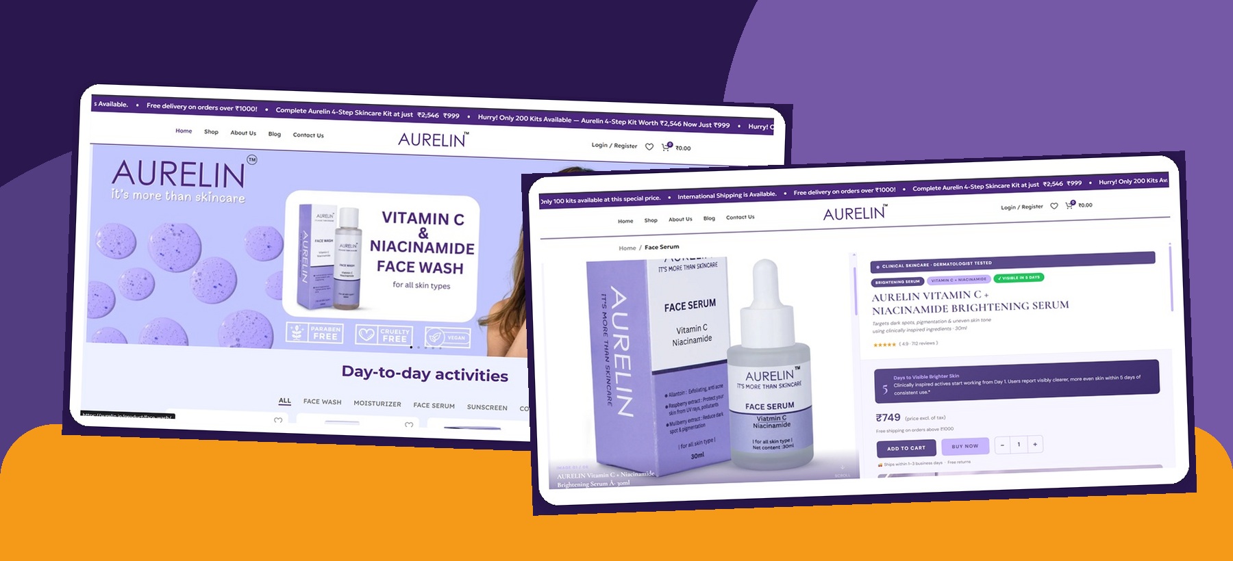
After — the redesigned homepage above the fold
The announcement ticker surfaces scarcity, shipping, kit value and price incentives before the shopper begins browsing.
The hero combines a human skincare moment with the product and a simple promotional message.
Day-to-day activity and category tabs help users move from intent to the right product faster.
The purple palette, clean whitespace and controlled typography preserve a premium, cohesive skincare identity.
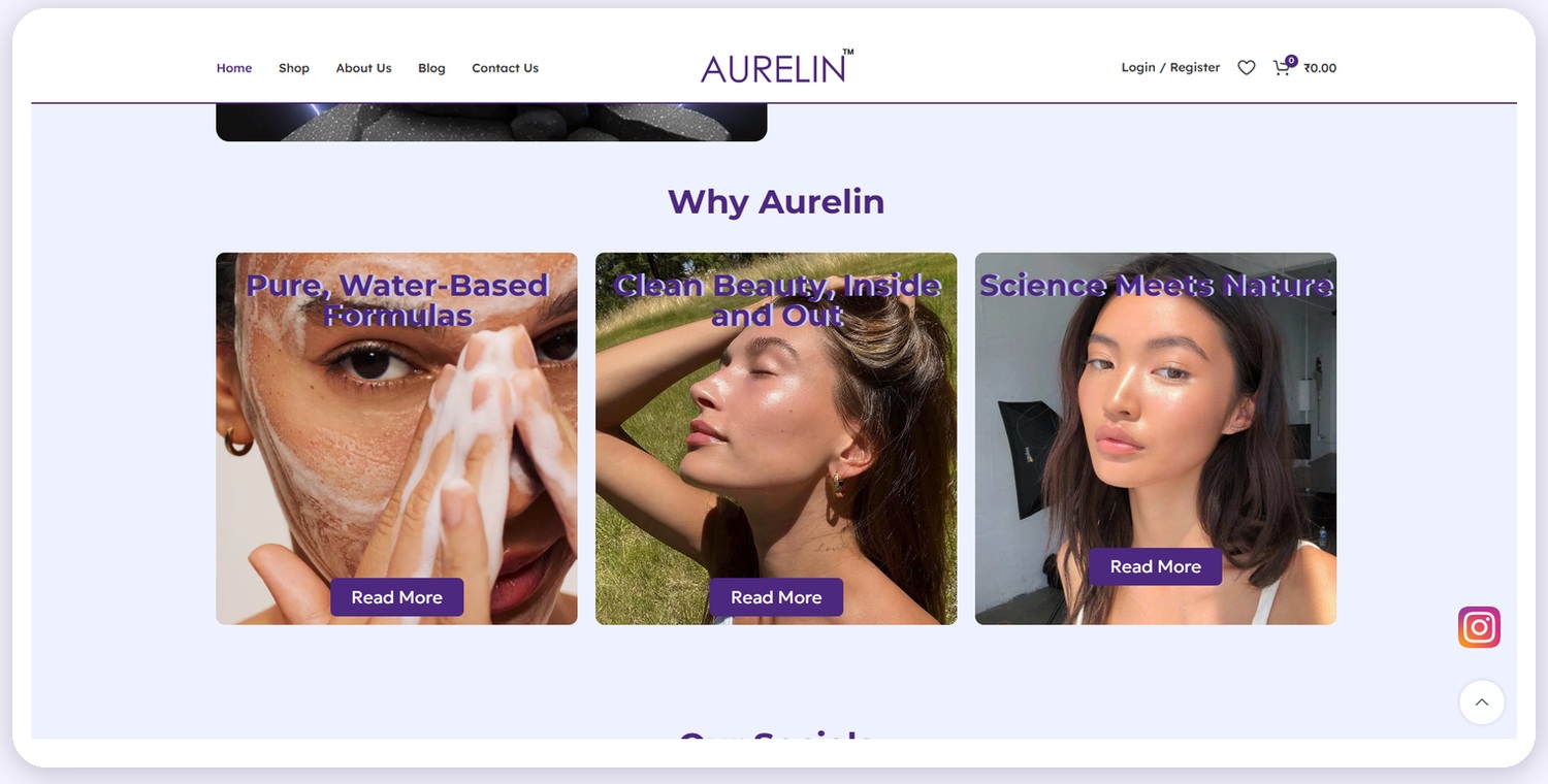
The redesigned homepage explains why Aurelin is different and gives shoppers more intuitive ways to find a relevant product.

Why Aurelin — differentiation cards

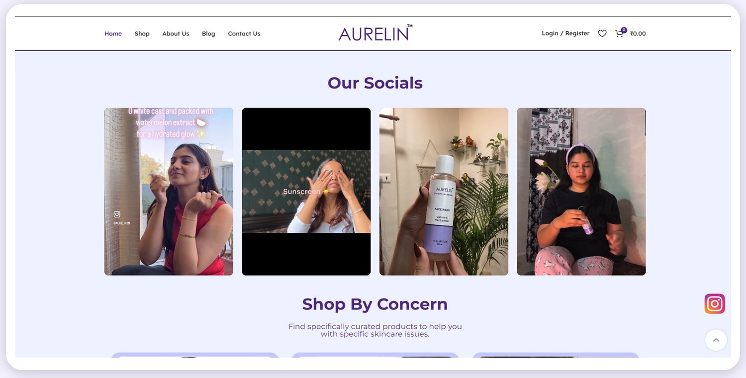
Our Socials (UGC) and Shop By Concern
"Pure, Water-Based Formulas", "Clean Beauty Inside and Out" and "Science Meets Nature" create a concise reason-to-believe framework.
Real-life product videos reduce the distance between brand promise and everyday use, making the experience feel more human and credible.
Shopping by concern supports visitors who know their problem but may not know which product category or ingredient they need.
Turning a product detail page into a structured, persuasive decision journey.

Before and after — the product page rebuilt around outcome, proof and action
Price and shipping incentives appear before product evaluation begins.
The product title names ingredients, concern and intended outcome.
Clinical, dermatologist-tested and ingredient signals reduce uncertainty.
A specific result window makes the promise easier to understand.
Review volume and score are available at the moment of evaluation.
Add to Cart, Buy Now and quantity controls form one clear purchase zone.
Shipping timing, threshold and returns sit directly below the CTAs.
Badges, cards and sections turn complex product information into an easy sequence.
Every major product promise is followed by a module that helps the shopper understand, verify or contextualize it.
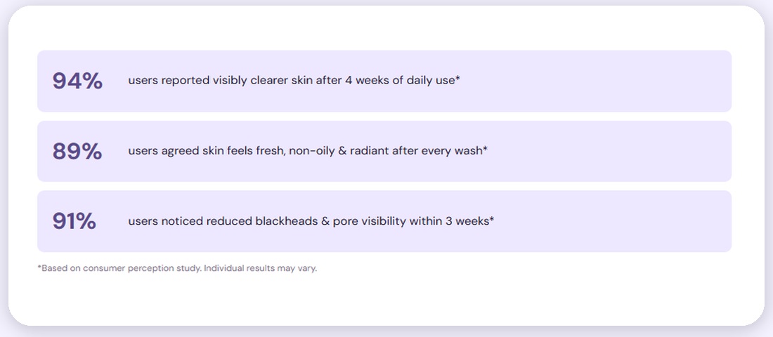
Large, scannable percentages turn abstract benefits into memorable evidence. The disclaimer keeps the presentation responsible and contextual.

Consumer-perception figures, as shown on the redesigned product page
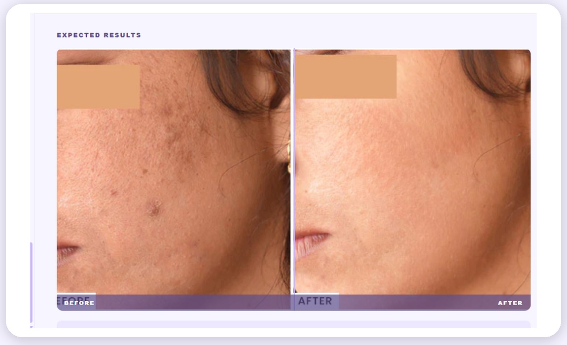
A before/after module gives shoppers a visual frame for the intended transformation and makes the product outcome easier to imagine.

Expected-results module, as shown on the redesigned product page
"Helps with", skin-type fit, Indian-weather relevance, formula details and ingredient content reduce hesitation before purchase.

Product education module — Helps With, What It Is, How It Works
What outcome can I expect?
What supports the claim?
Is this right for my skin?
How and why does it work?
What should I do next?
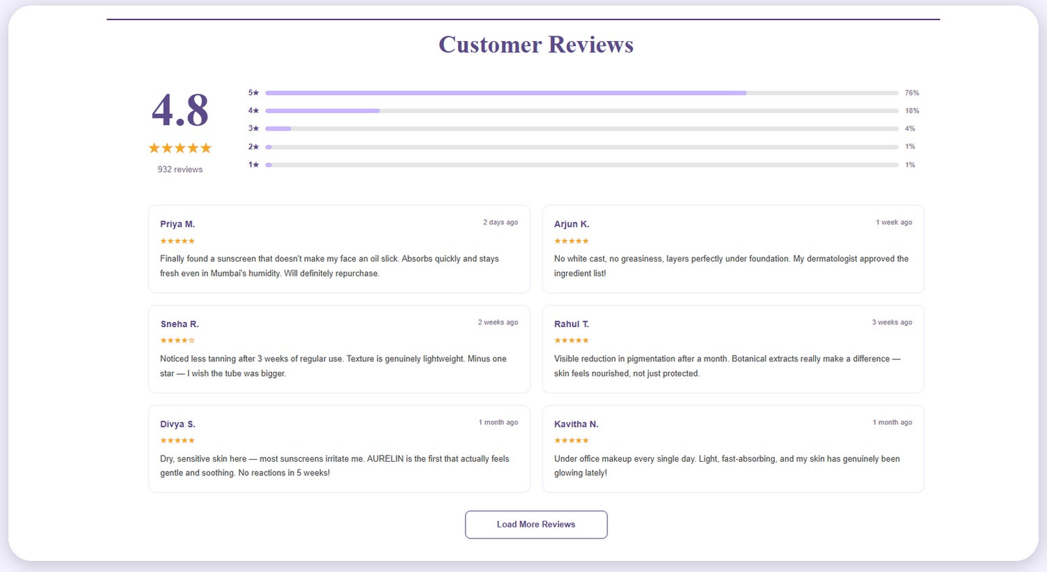
Social proof is elevated from a supporting detail into a visible, decision-making layer.

The redesigned Customer Reviews section
A large average score and distribution bars give shoppers a fast trust signal.
Reviews mention humidity, makeup layering, sensitivity, tanning and pigmentation.
Different timelines and occasional minor criticism make the section feel less artificial.
The "Load More Reviews" control supports further validation without overwhelming the first view.
A connected system that guides the visitor from first impression to informed purchase.
Offer ticker, hero promotion and activity-based categories.
Concern language, ingredient cues and benefit-led product titles.
Dermatologist signals, reviews, UGC and consumer-perception content.
Visible result timeline, fit, mechanism and expected-result presentation.
Prominent Add to Cart / Buy Now, quantity, shipping and returns.
| Area | Before | After Redesign |
|---|---|---|
| Positioning | Generic product and clean-beauty presentation. | A specific story centred on Indian skin and Indian weather. |
| Product Hierarchy | Title, price, short description and standard benefits. | Outcome, concern, ingredients, rating, proof, price and action in sequence. |
| Calls to Action | Buttons present, but weak supporting motivation. | CTAs reinforced with urgency, shipping, returns, quantity and trust. |
| Proof | Limited to basic icons and product copy. | Consumer-perception figures, expected results, reviews and UGC. |
| Discovery | Traditional navigation and product categories. | Day-to-day activities, social content and shopping by concern. |
| Decision Support | Little help for fit, usage or mechanism. | Skin-type fit, weather relevance, what it is and how it works. |
The redesigned experience establishes a clearer conversion path, stronger product differentiation and substantially more decision support.
BoroTech Solution redesigns e-commerce experiences around relevance, proof, trust and decisive action — delivered by website strategy, UX restructuring, UI redesign, conversion-focused product pages and brand messaging.